“The character of the Noble Savage is in all of us. Finding harmony in wildness and delight in taming temptation.”
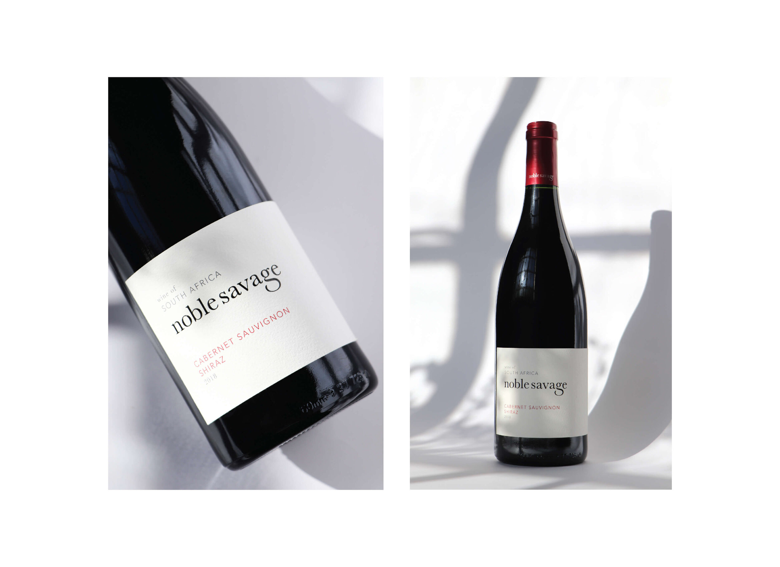
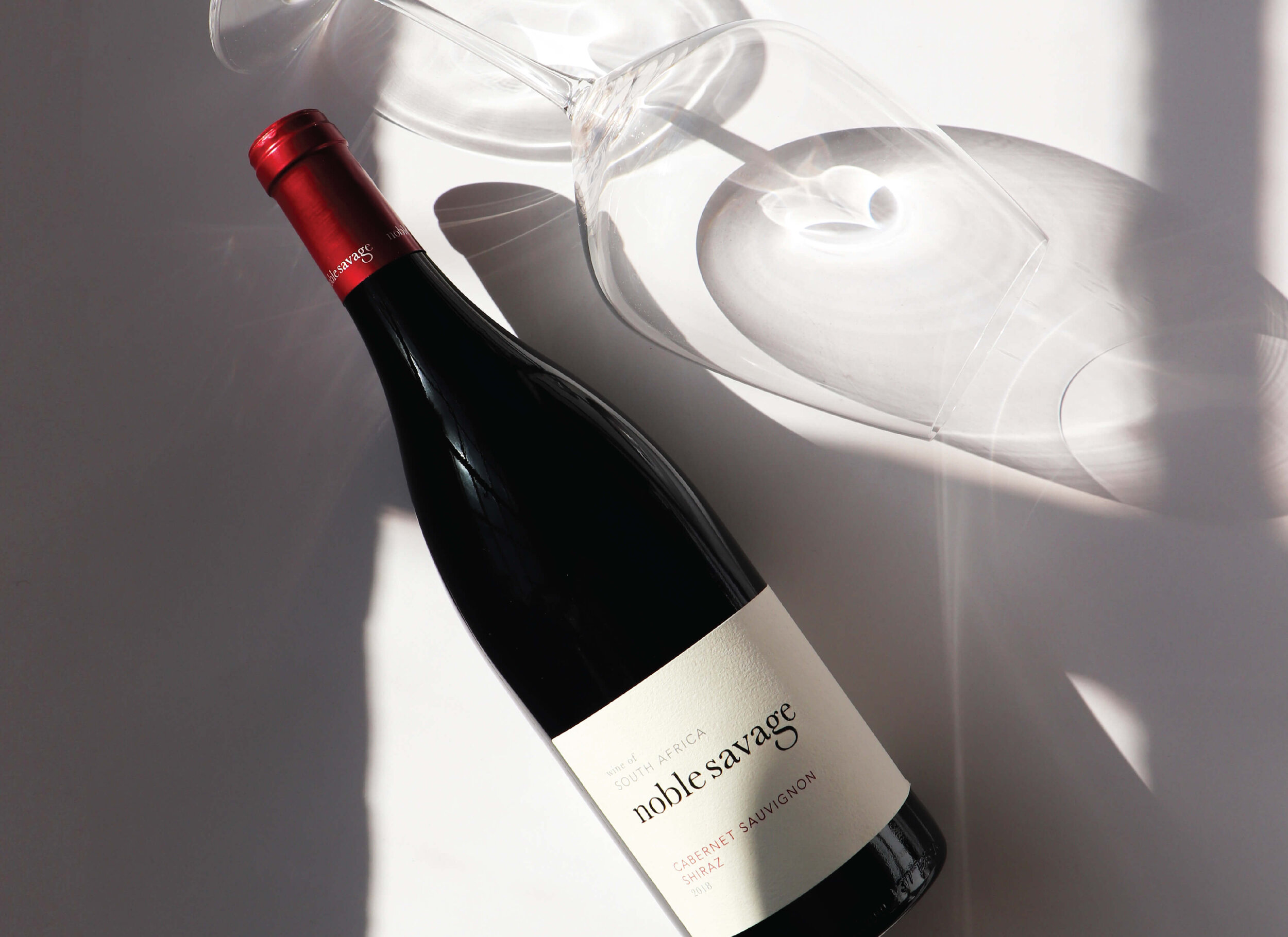
The redesign of the Noble Savage wine range aimed at leveraging off the parts of the previous design that were identifiable and carried the most brand equity.
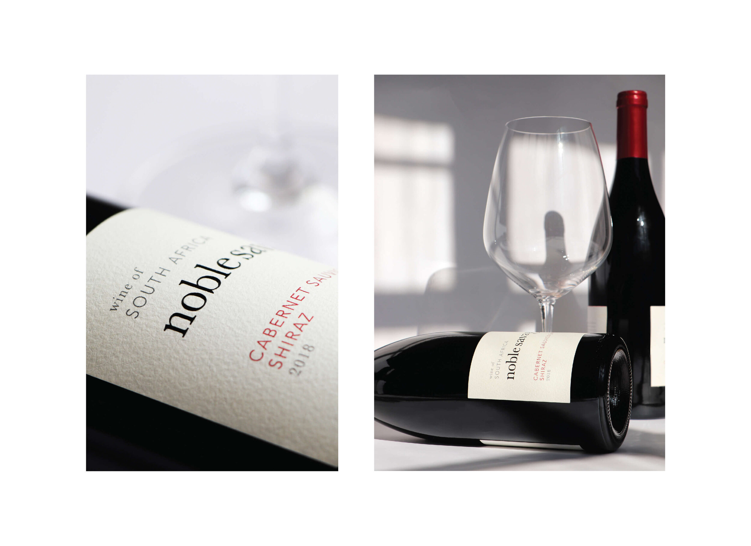
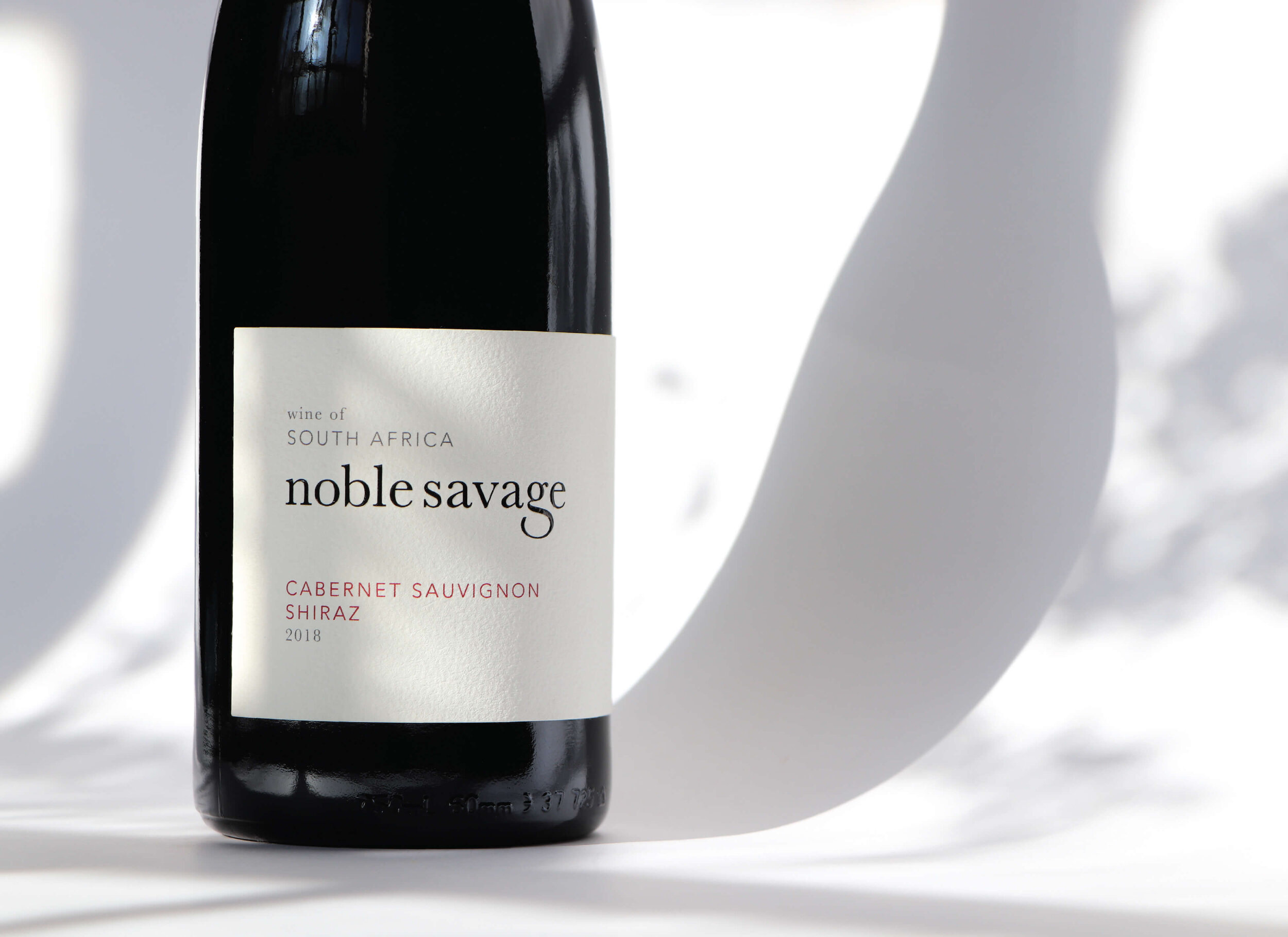
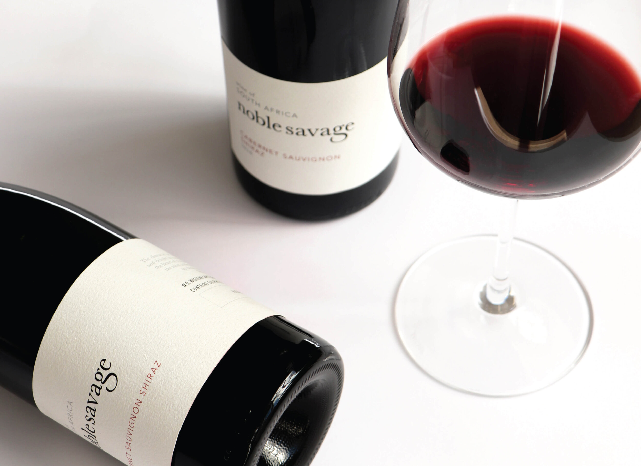
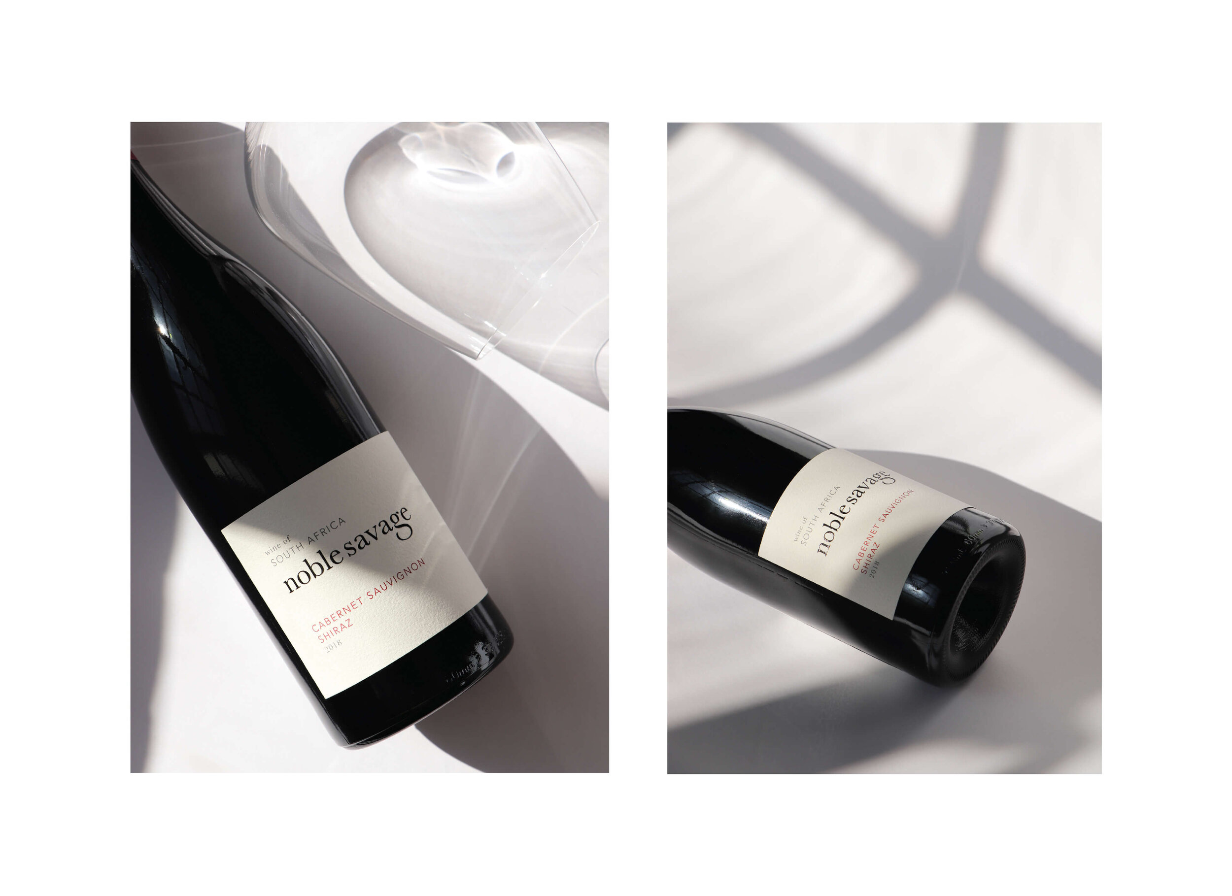
The strength of the Noble Savage brand lies in the logo, with its typeface being both mischievous and distinct at the same time. We, therefore, kept it as the most prominent feature of the new design. We removed the illustrations, instantly allowing the label size to decrease creating room for white space around the remaining elements.
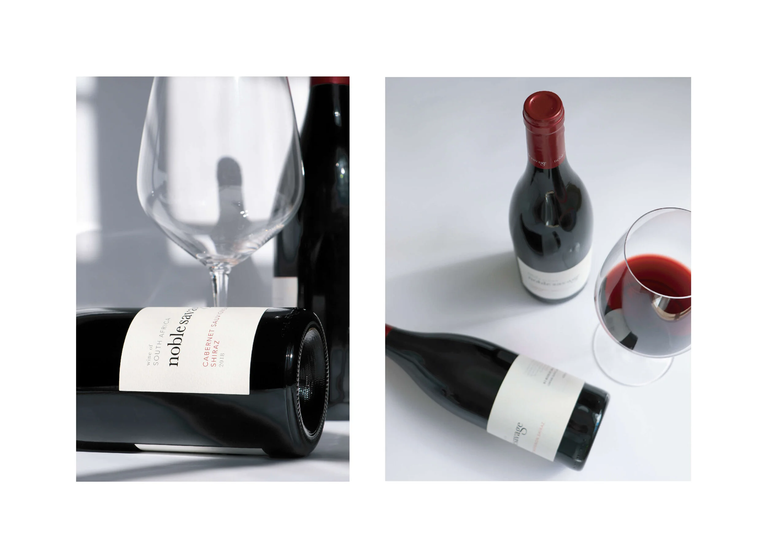
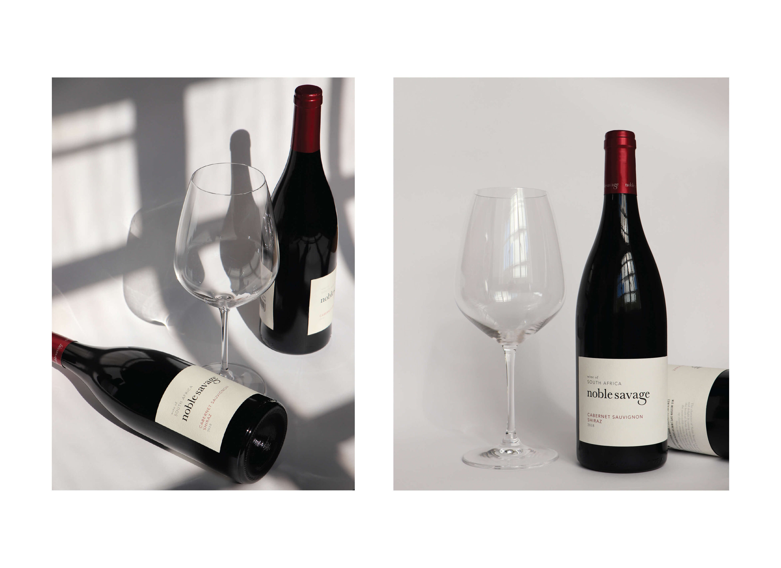
The red of the capsule was matched to the red typography on the label making the varietal stand out but also linking the new design back to the previous designs where red was an important secondary colour.
The wrap label allowed for all the information to be on one label that spanned over the horizontal area and placed emphasis on the copy being an important first impression of the wine. The paper we chose is a thick, uncoated paper that elevated the brand and created a natural base for the gloss of the high build on the logo to stand out.
“Made in Nature and elevated to conquer, the heart of Noble Savage is courageous and good.”
SERVICES:
Packaging Design | Photography | Project Management | Production Management
