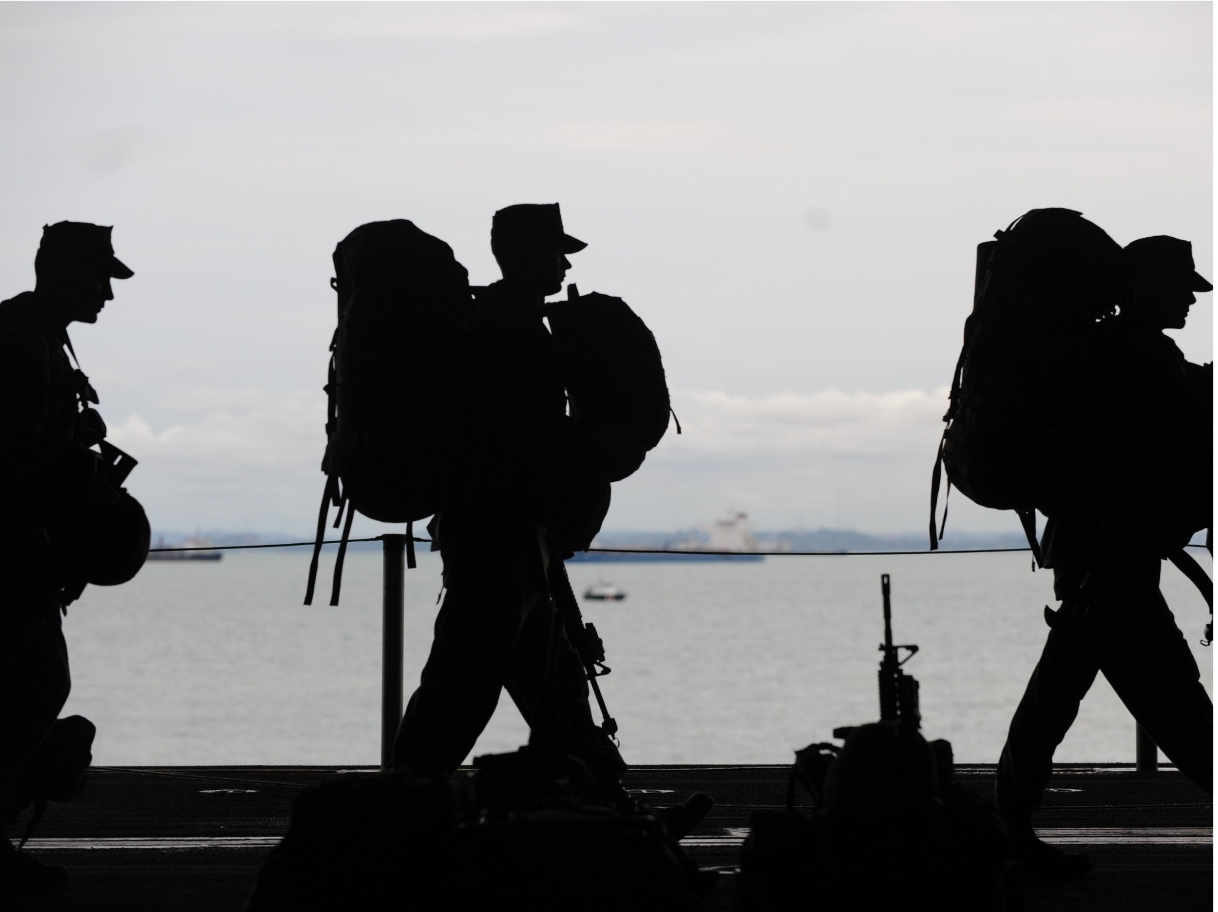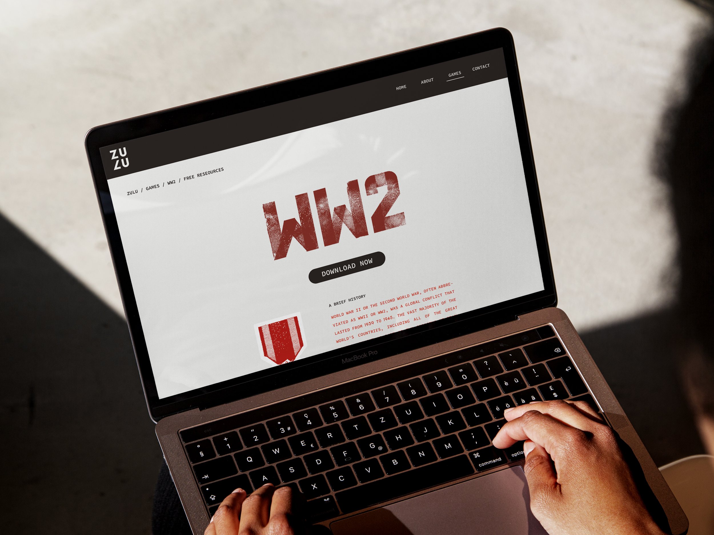
We take immense pride in introducing one of our creations: ZULU Wargaming. Born from the storied history of global conflicts, ZULU Wargaming isn't just another war game; it’s a dynamic narrative that breathes life into the strategic nuances of historical battles.
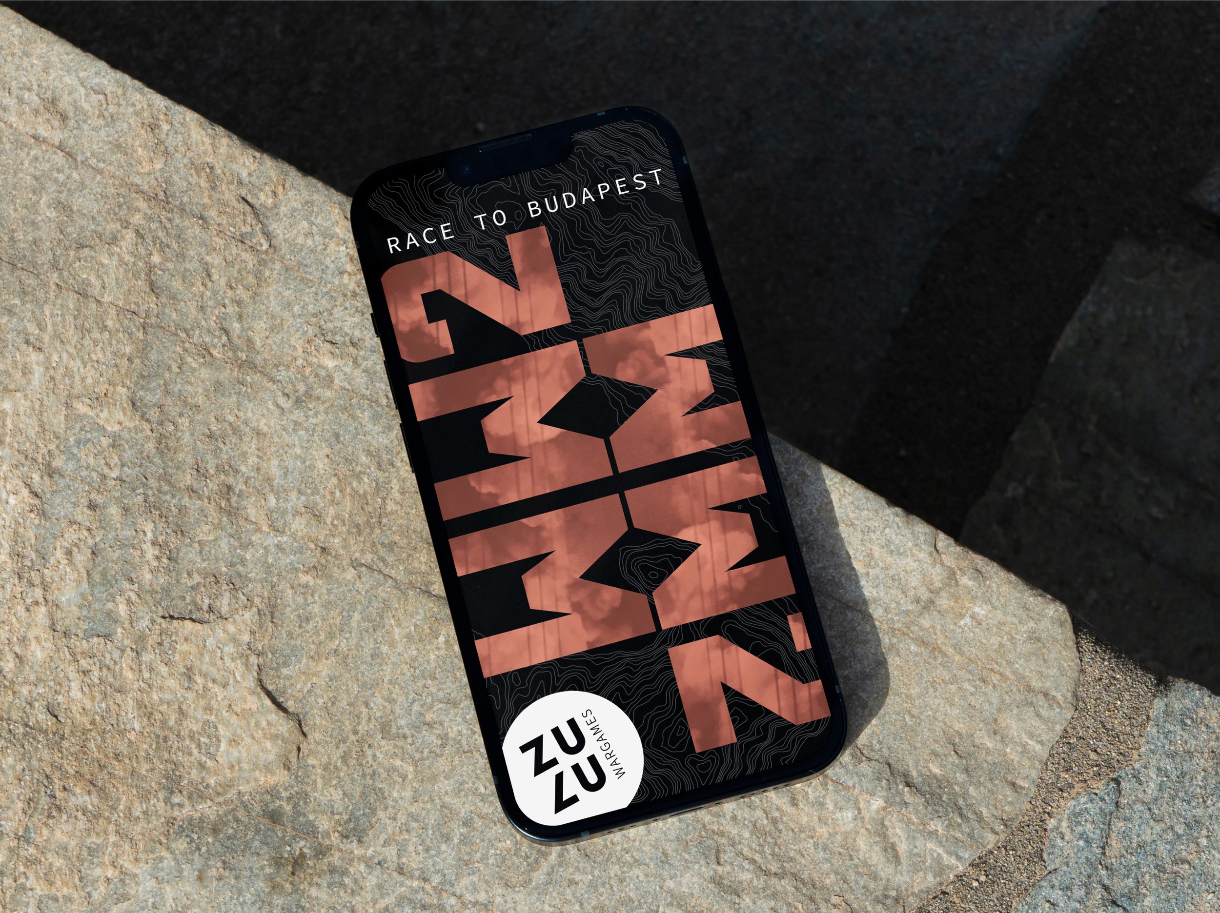
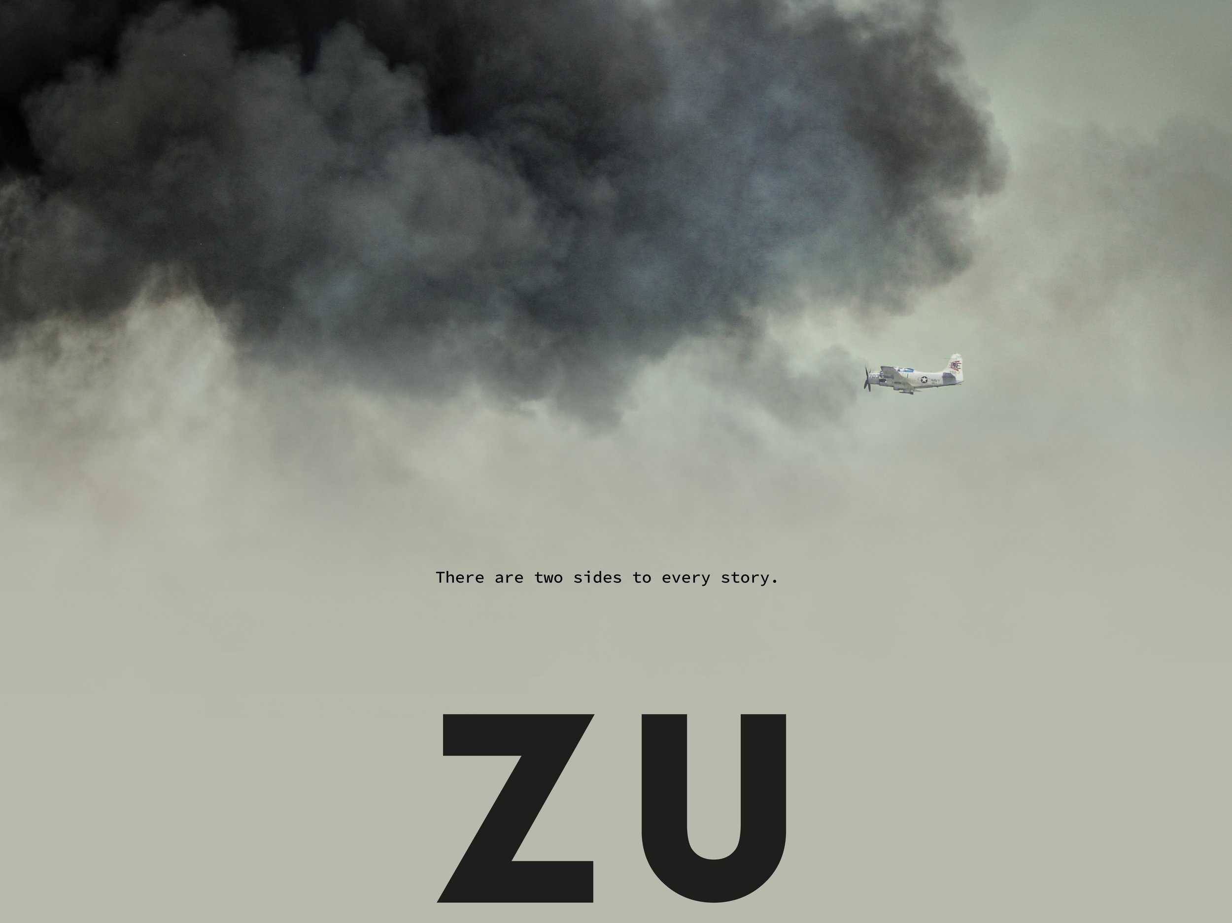
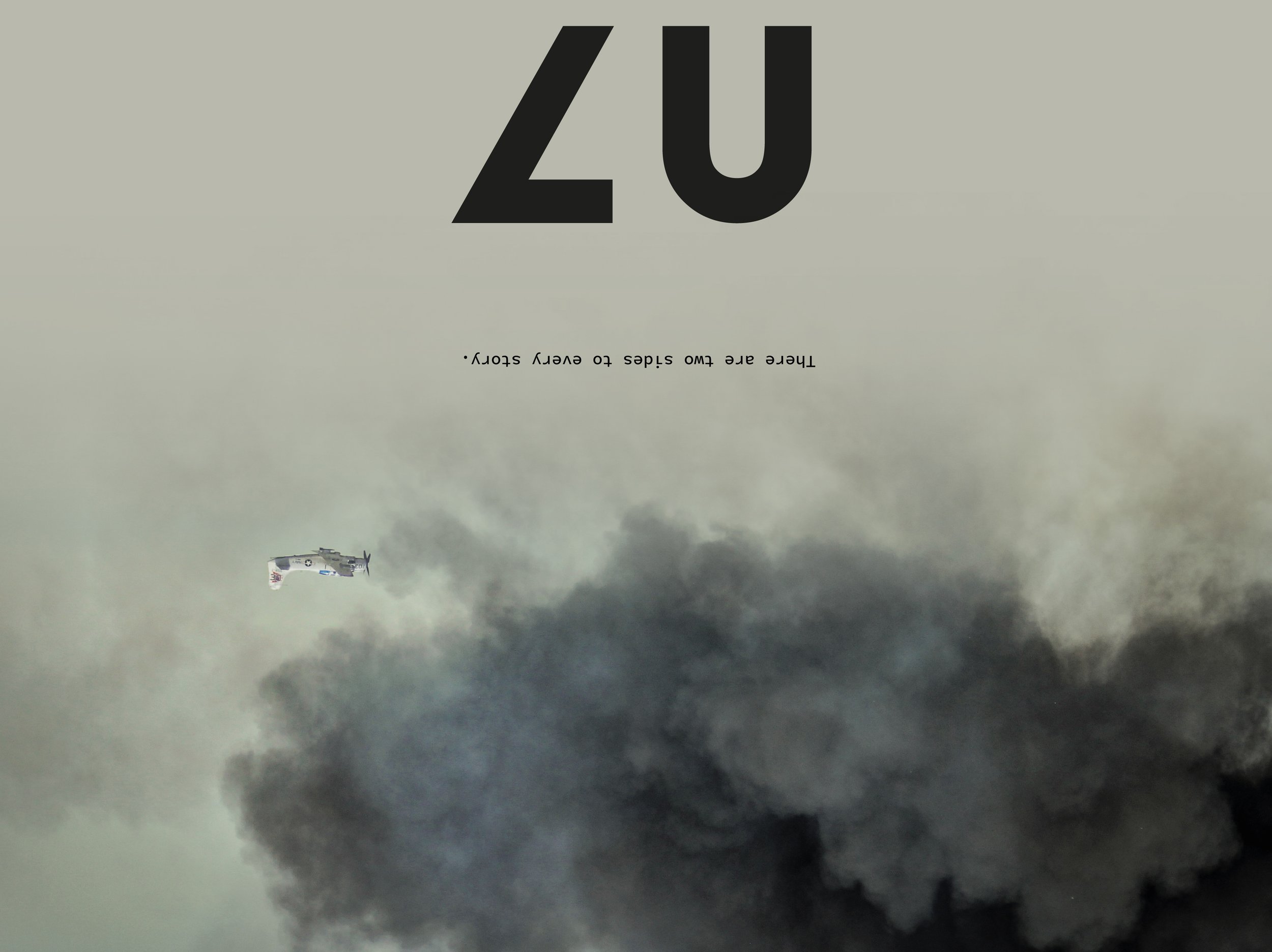
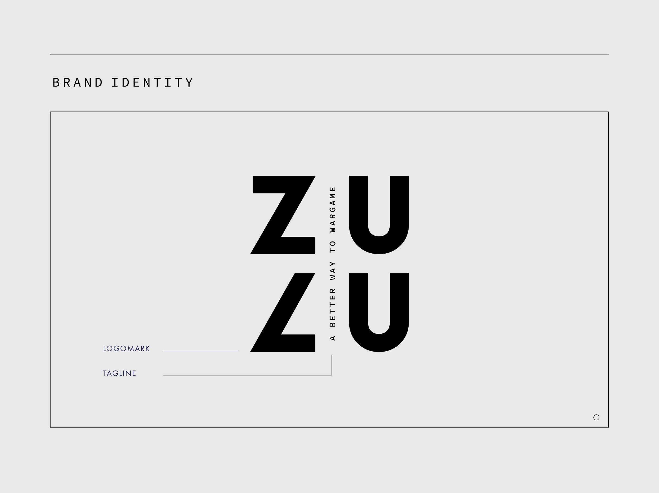
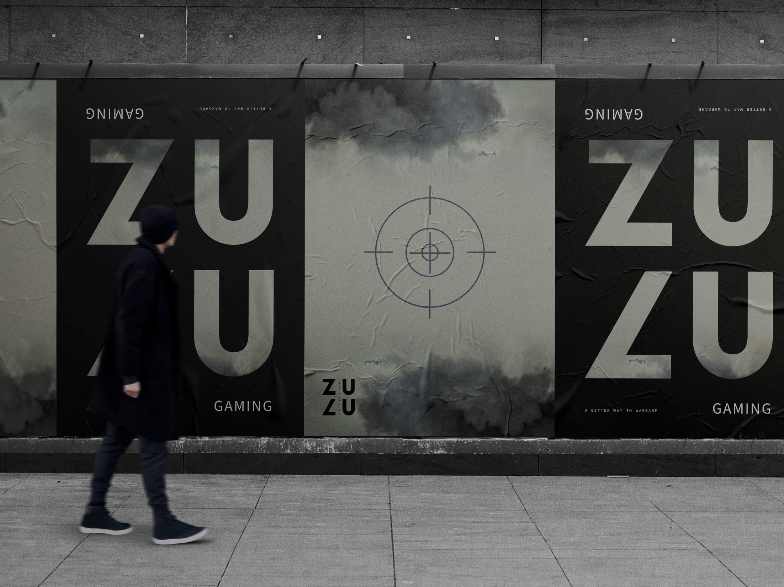
The name "ZULU" echoes the morse code of World War II, a subtle nod to the communication tactics that shaped modern warfare. In crafting the logo and brand identity, we leaned heavily into the dichotomy of war, reflecting its inherent duality. Mirroring and reflecting elements were meticulously incorporated, symbolizing the two opposing sides in every conflict. We further distinguished ZULU Wargaming by embracing white space, a stark contrast to the typically cluttered designs of traditional war games. This clean, minimalist approach amplifies the intensity of the game’s core elements without overwhelming the player.
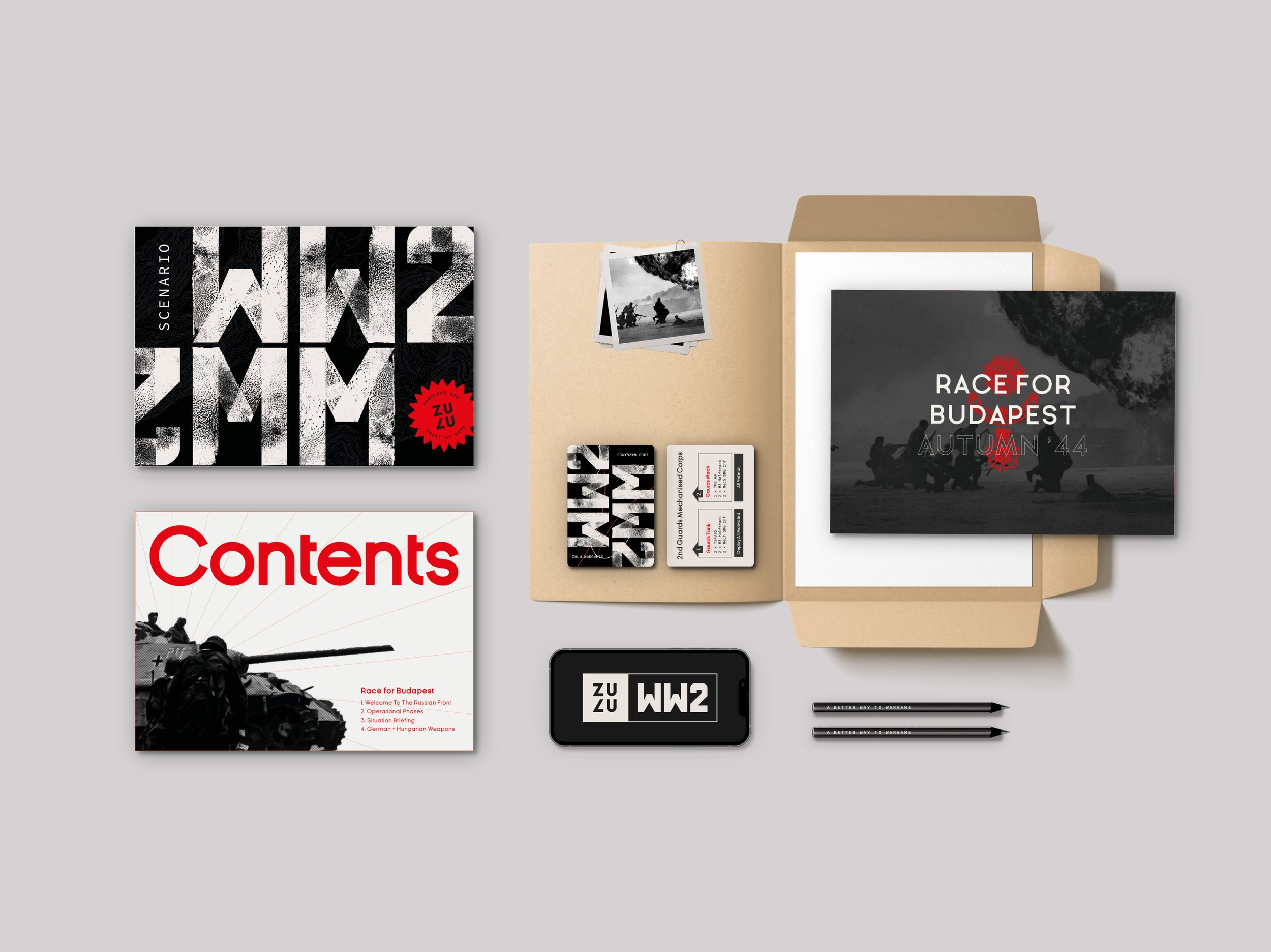
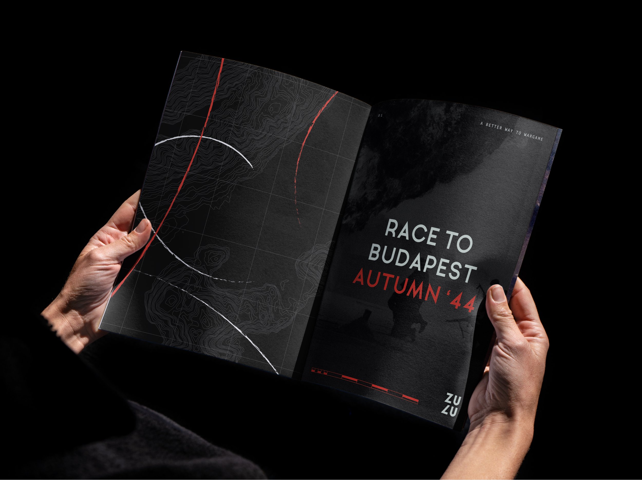
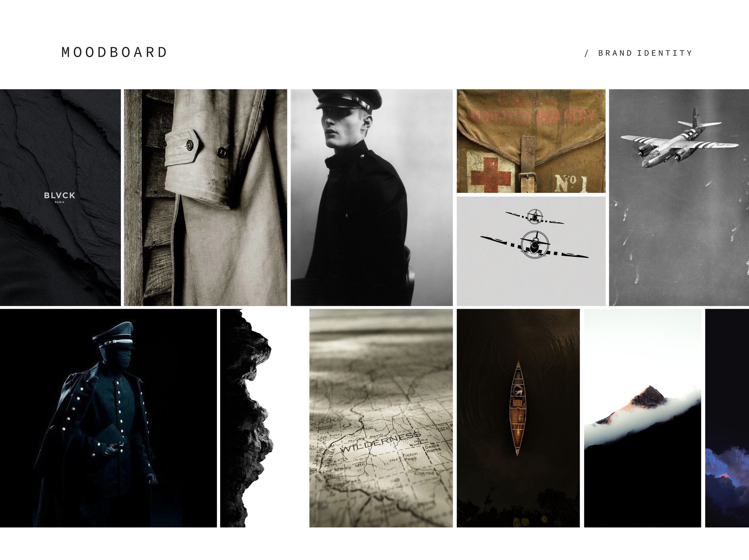
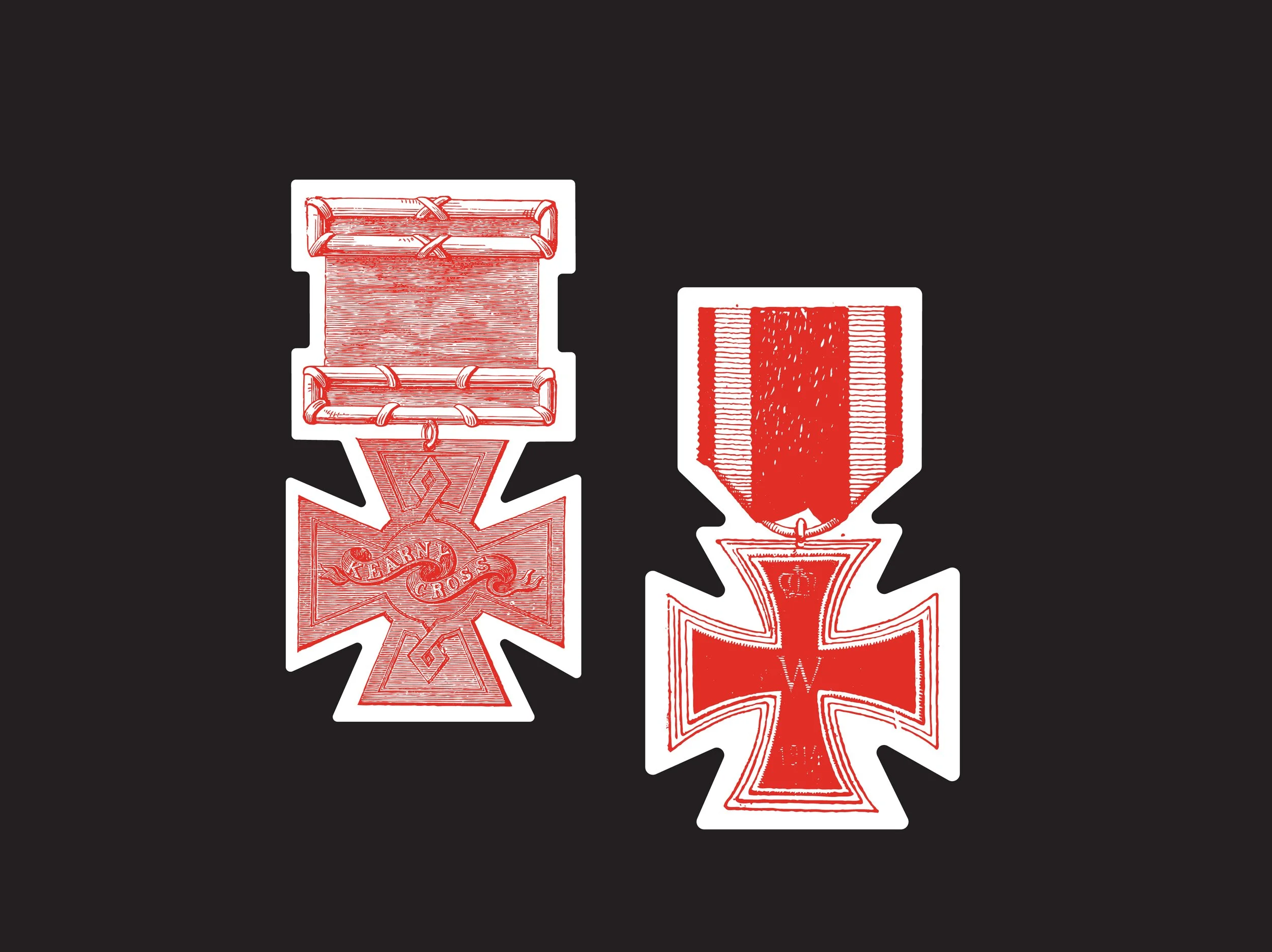
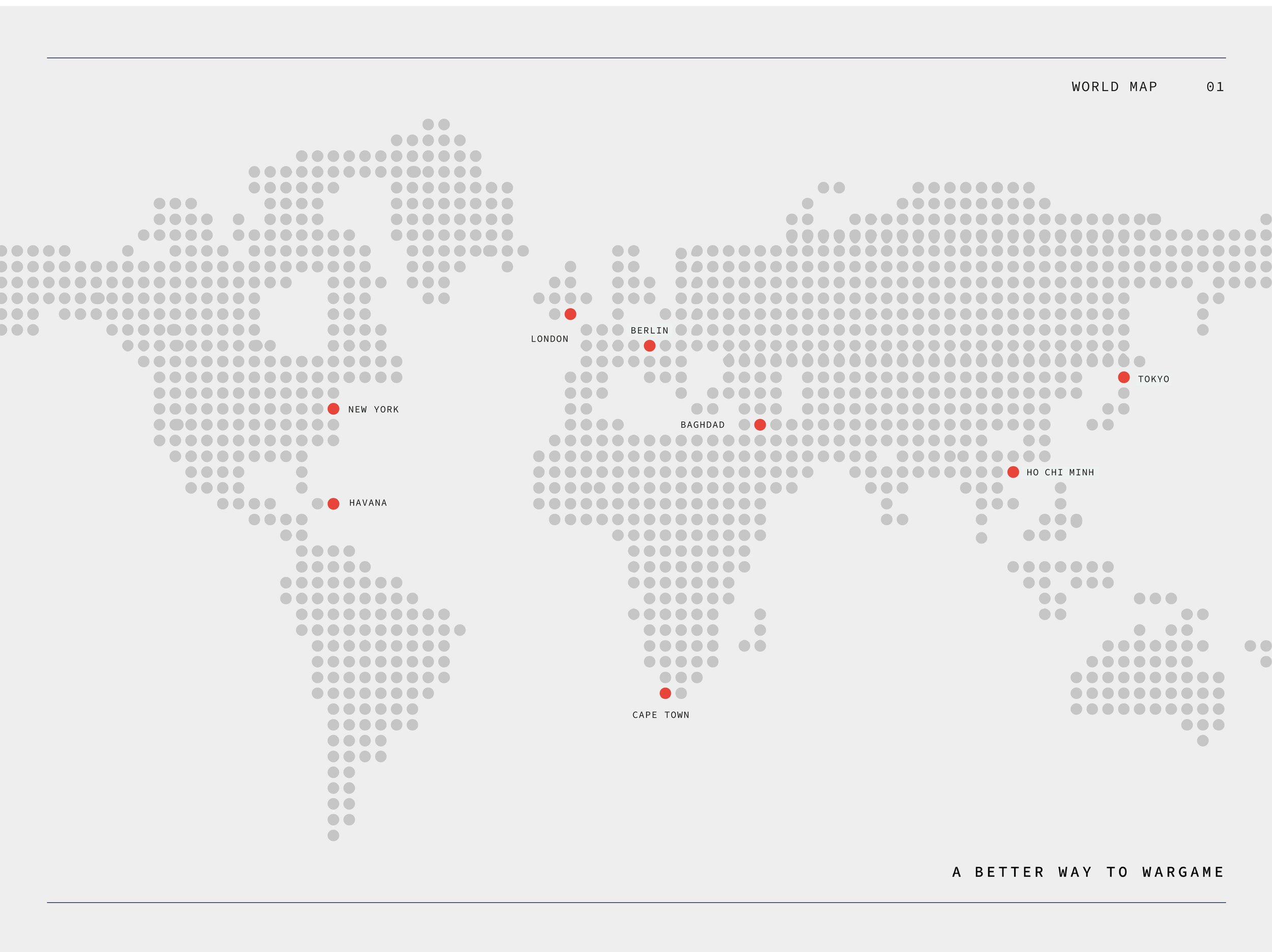
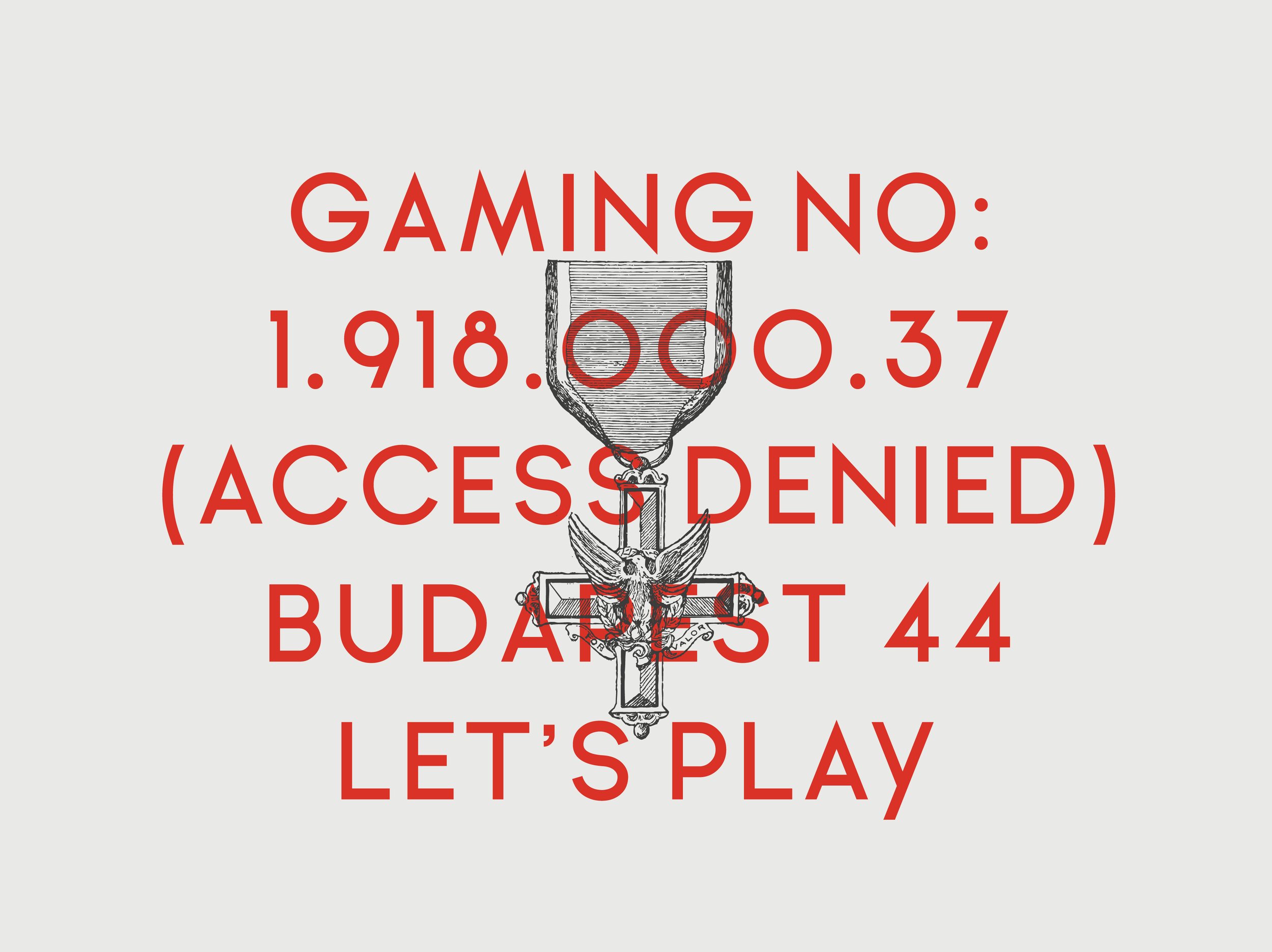
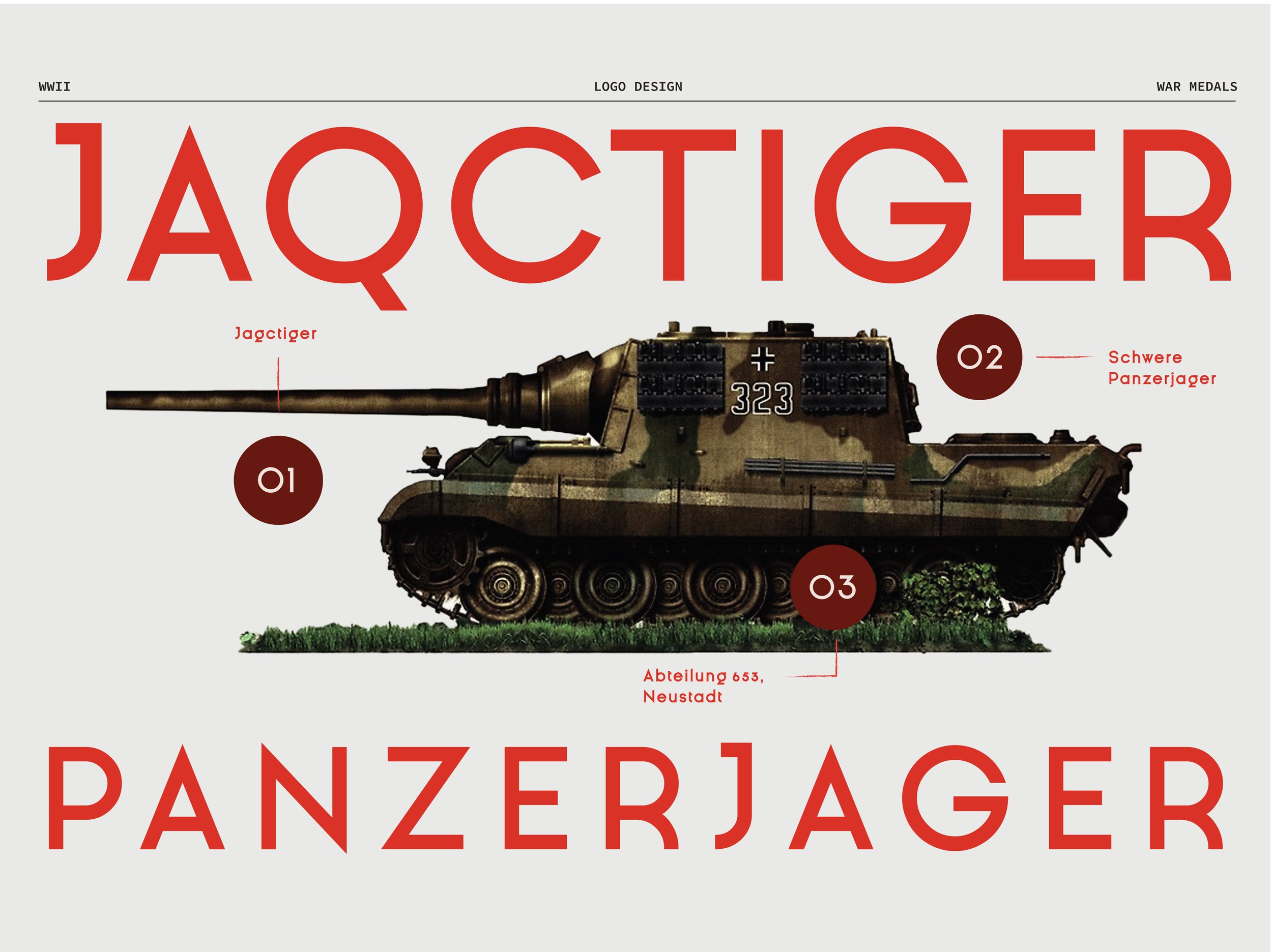
Our colour palette, dominated by the powerful hues of red, white, and black, evokes the visceral imagery of war. Textures and graphics were thoughtfully layered to bring the gritty reality of warfare to the forefront, all while maintaining a modern and straightforward aesthetic. With the tagline, "a better way to wargame," ZULU Wargaming promises a refined, immersive experience that stands apart in the crowded market of war games.
SERVICES:
Brand Identity Design | Tagline Creation | Copywriting | Brand Collateral Design | Project Management
