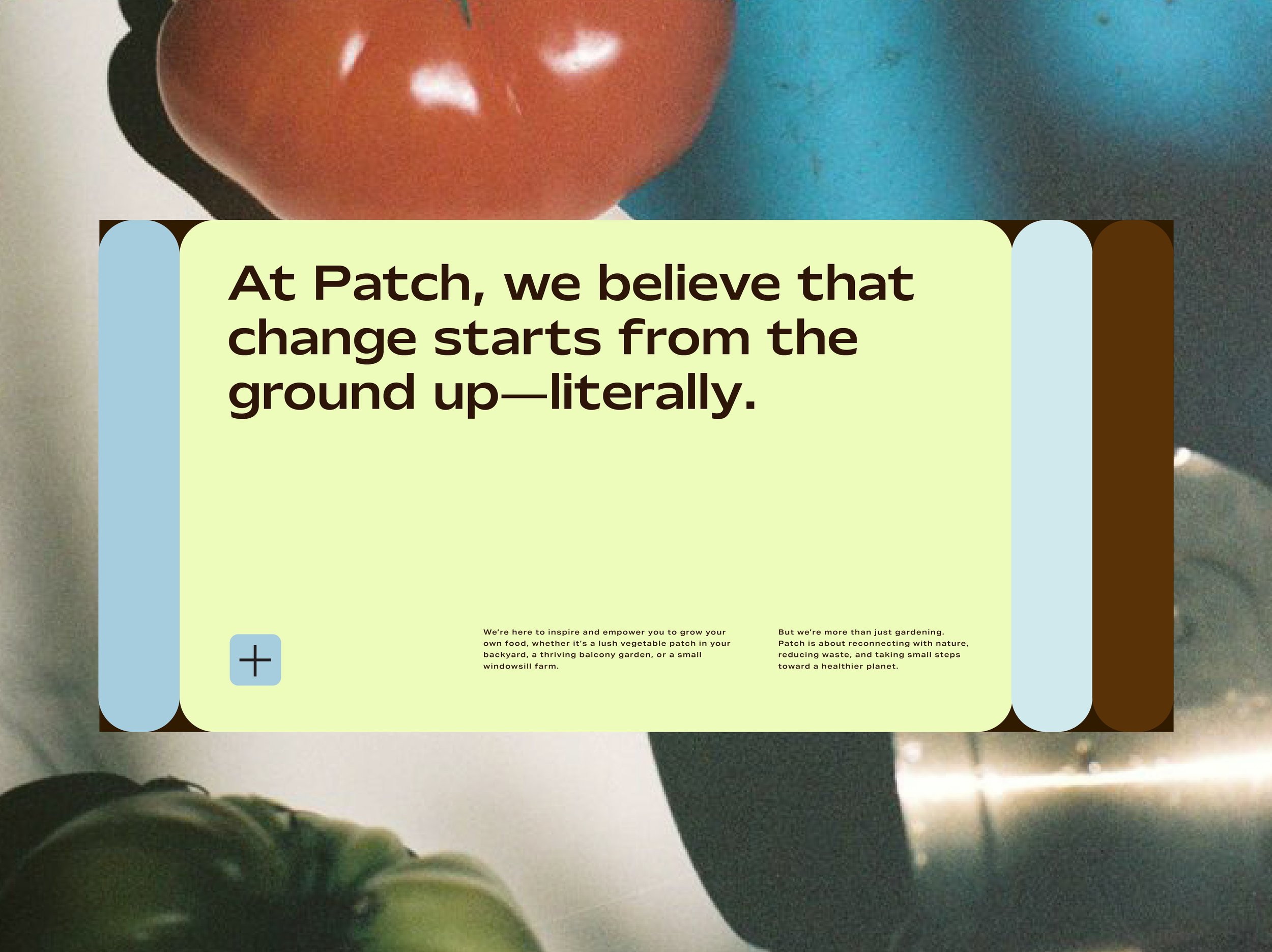

In a world where food systems are strained, Patch believes in cultivating something different—a movement where nutritious food is grown and shared locally, empowering communities to thrive. Imagine a world where you can trade your neighbour some freshly picked beetroot, for some heirloom tomatoes.
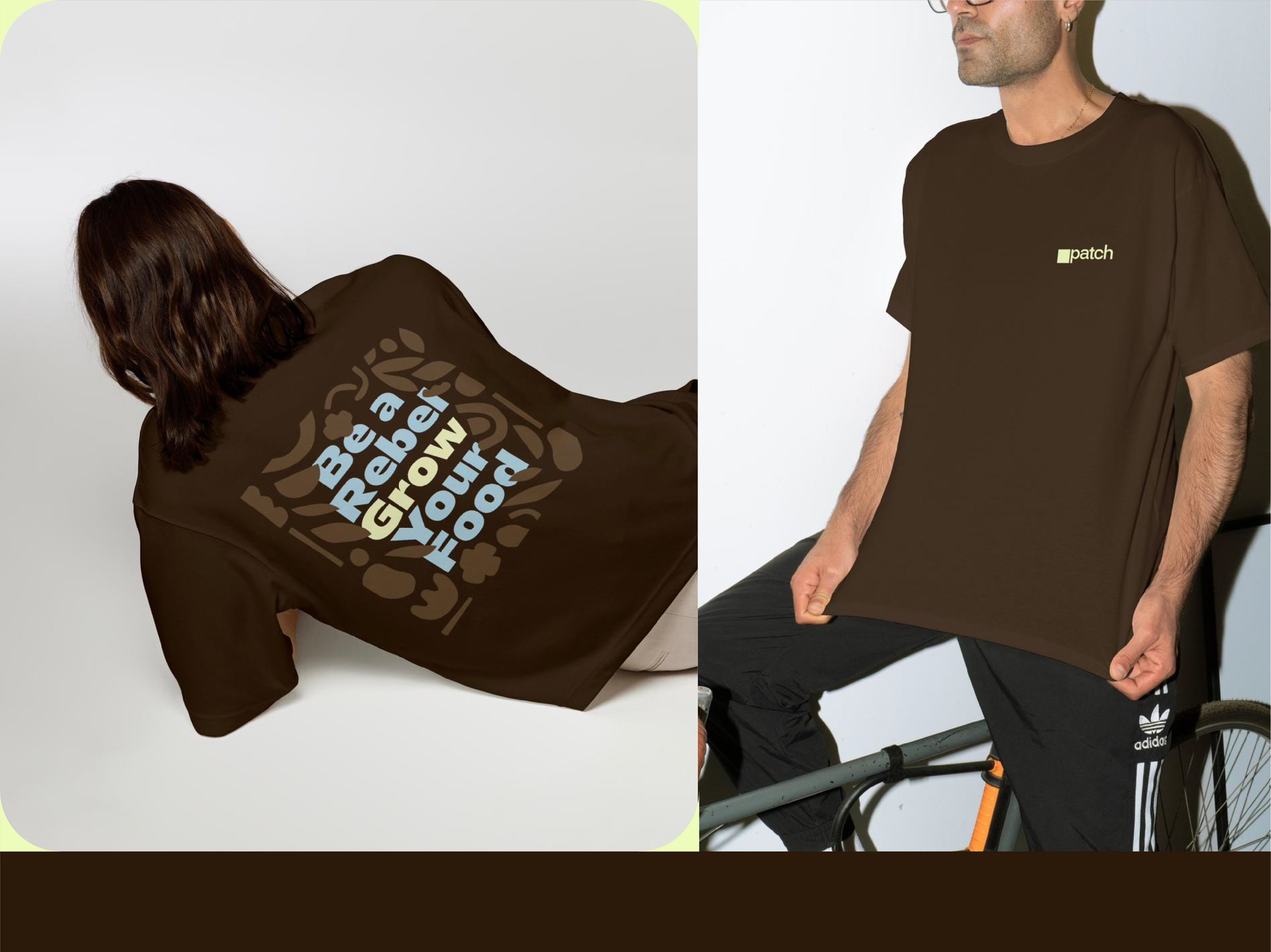
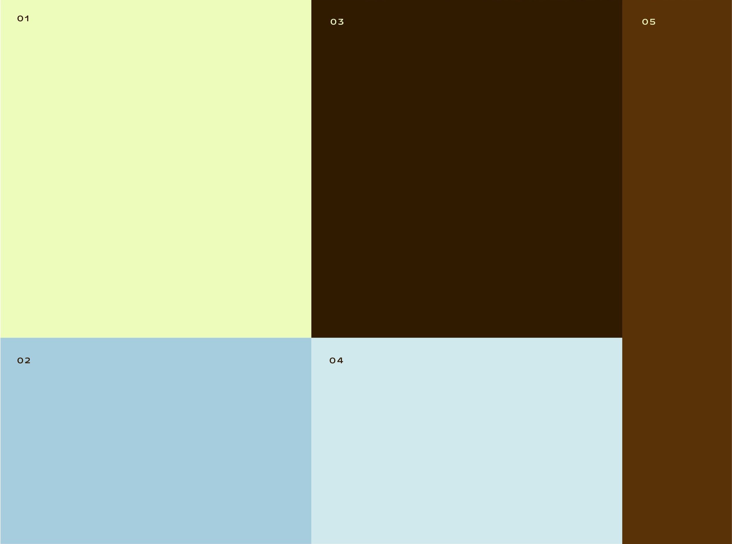
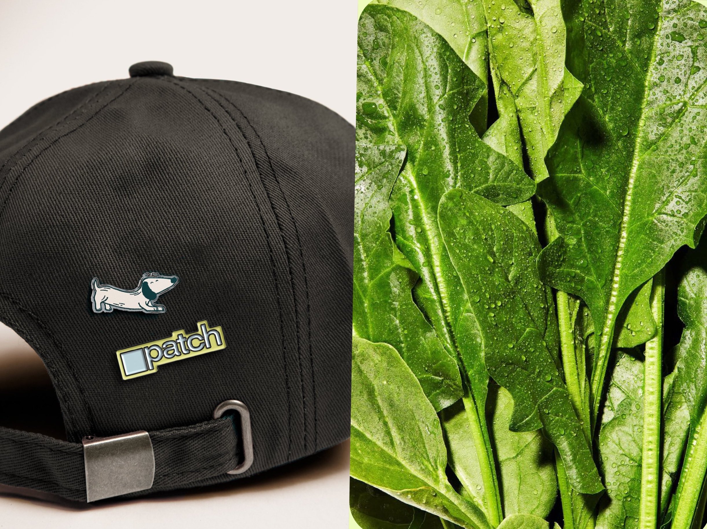
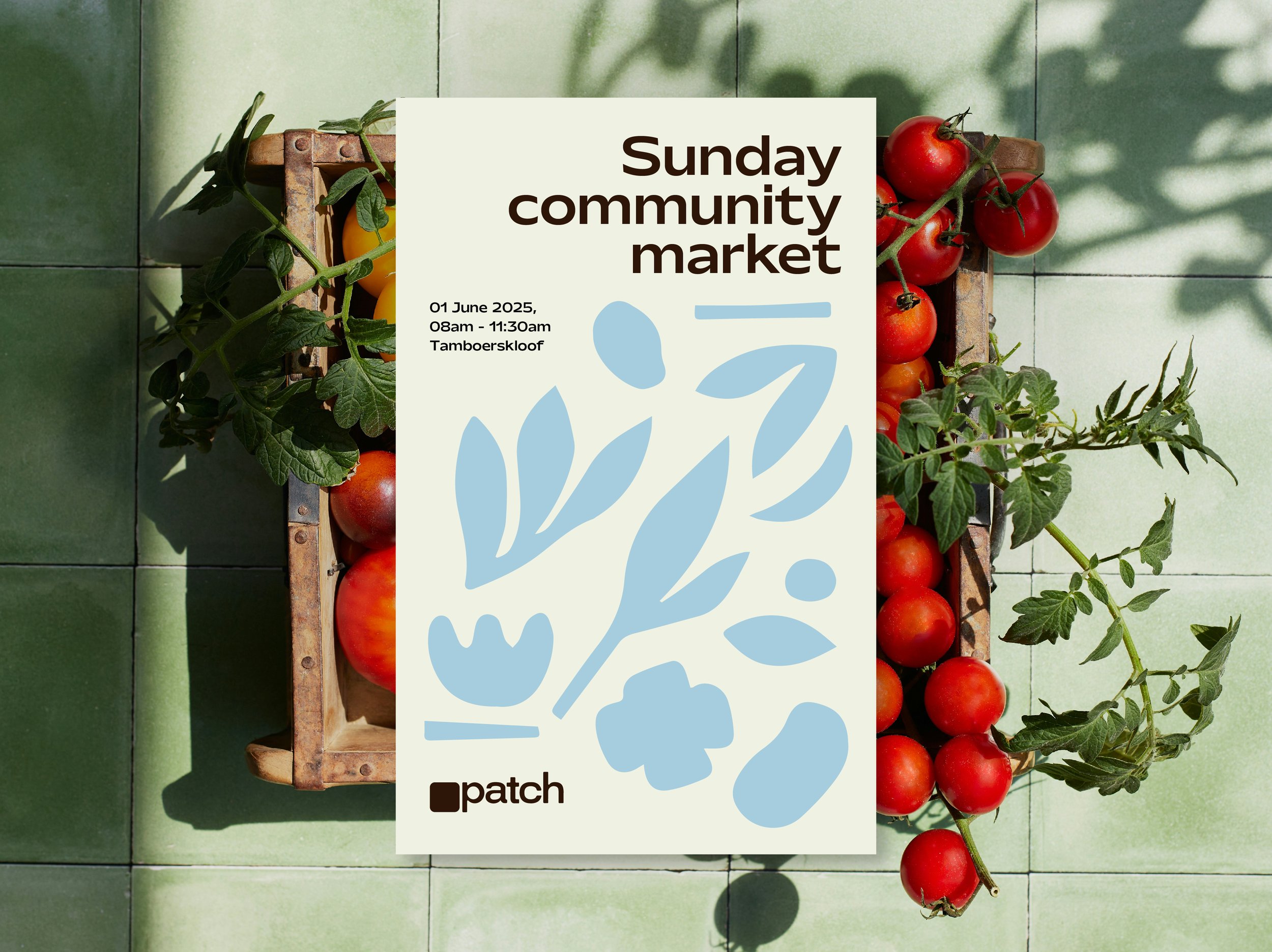
Patch’s identity is rooted in the essential elements needed for growth: water, soil, and sunlight. These are captured in a considered palette of light blue, rich dark brown, and vibrant lime yellow. Beyond these core colors, the brand’s vision expands through its photography, where a full spectrum of natural hues from fresh produce brings energy and vibrancy to life.
At its heart, Patch is about people. With the tagline “Community Grows Here,” the brand’s design was carefully crafted to feel welcoming, inclusive, and focused on the power of collective growth.
The logo, a simple yet powerful symbol of a vegetable patch, ties it all together—reminding us that big change often starts small.
Rooted in its mission to revolutionize food systems, Patch’s brand design balances approachability with a deep commitment to empowering communities to grow and access nutritious food—turning a simple vegetable patch into a global call for change.
SERVICES:
Brand Identity | Brand Collateral Design