Your mission, our passion.
As a people-centric business that strives for excellence and value, Barrios technology provides Aerospace engineering services. The Barrios team is equipped, agile and adaptable to what is needed for every project. They are passionate about what they do and the missions they support. All these strengths within the business lead to them being around for more than 40 years. Within this period, Barrios focused on striving for perfection in their offerings and growing their team, leaving the brand identity to fall behind in terms of carrying the substance of the brand.
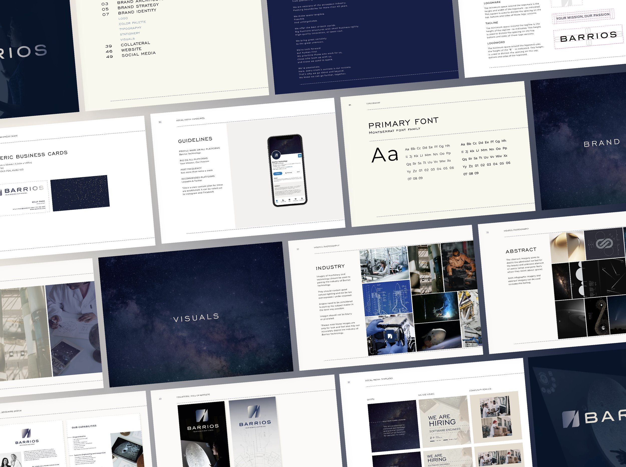
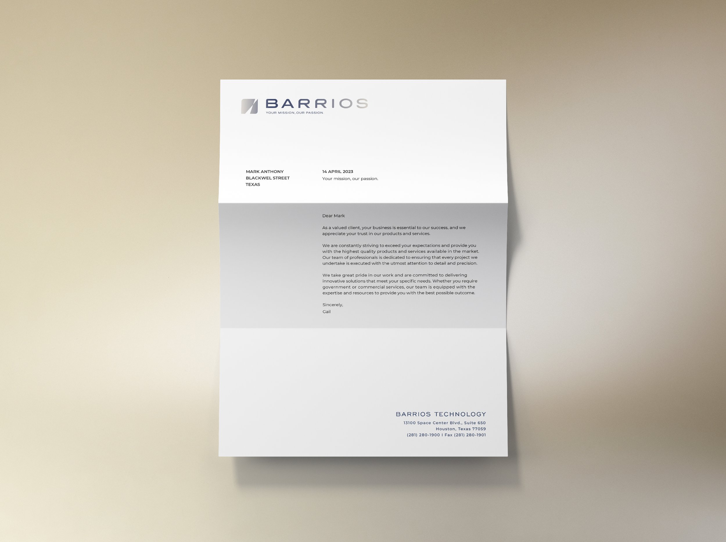
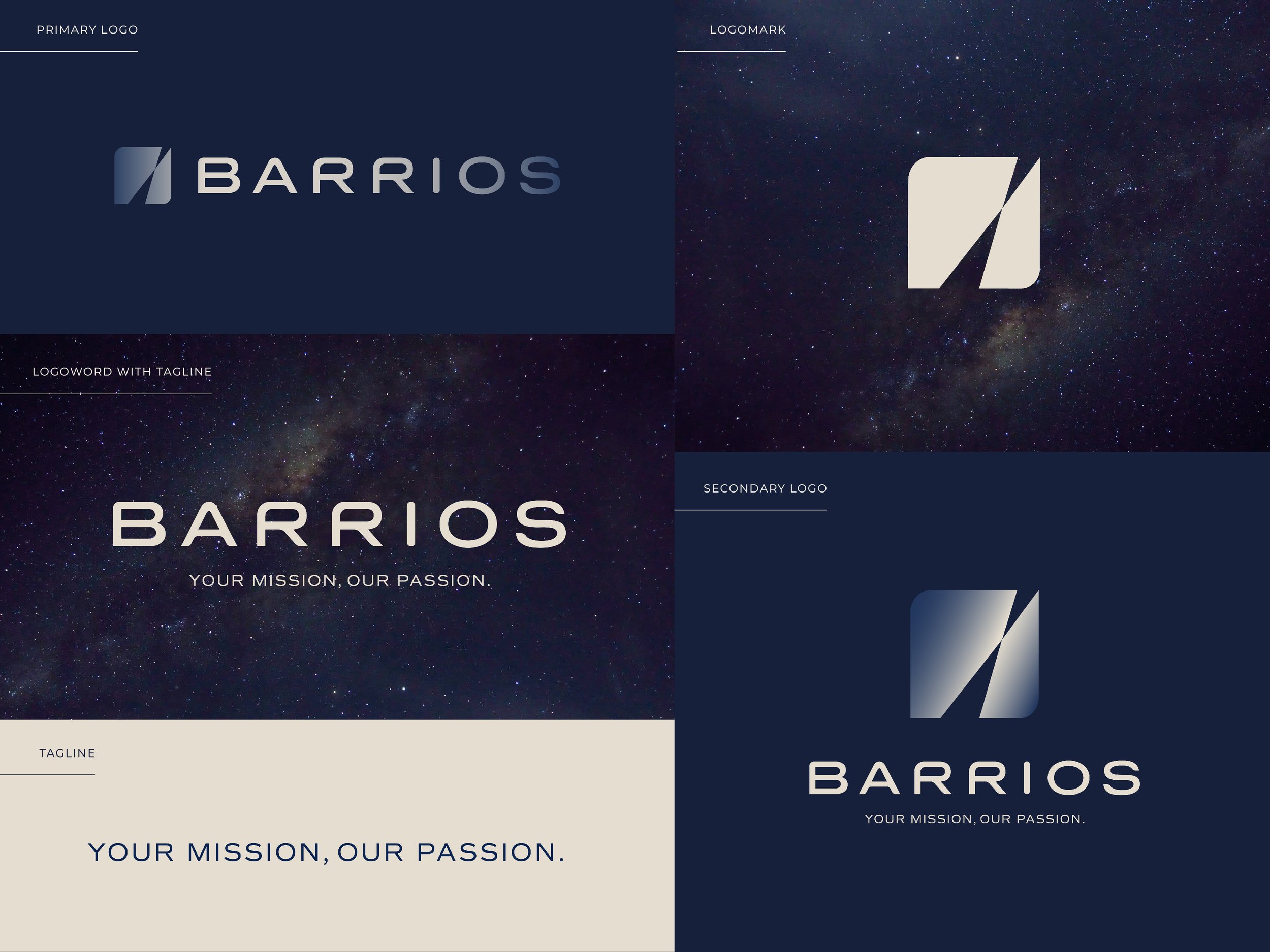
This lead to us being tasked with a full brand update, to align their look with their excellence. Because of the brand equity that had been built up for 40 years, we drew inspiration from the previous logomark and made the update thereof, the first step of the design process. The mark symbolises movement, from earth into outer space. The rounded edges creates a modern feeling and also emphasised the softer, human-focused side of the brand.
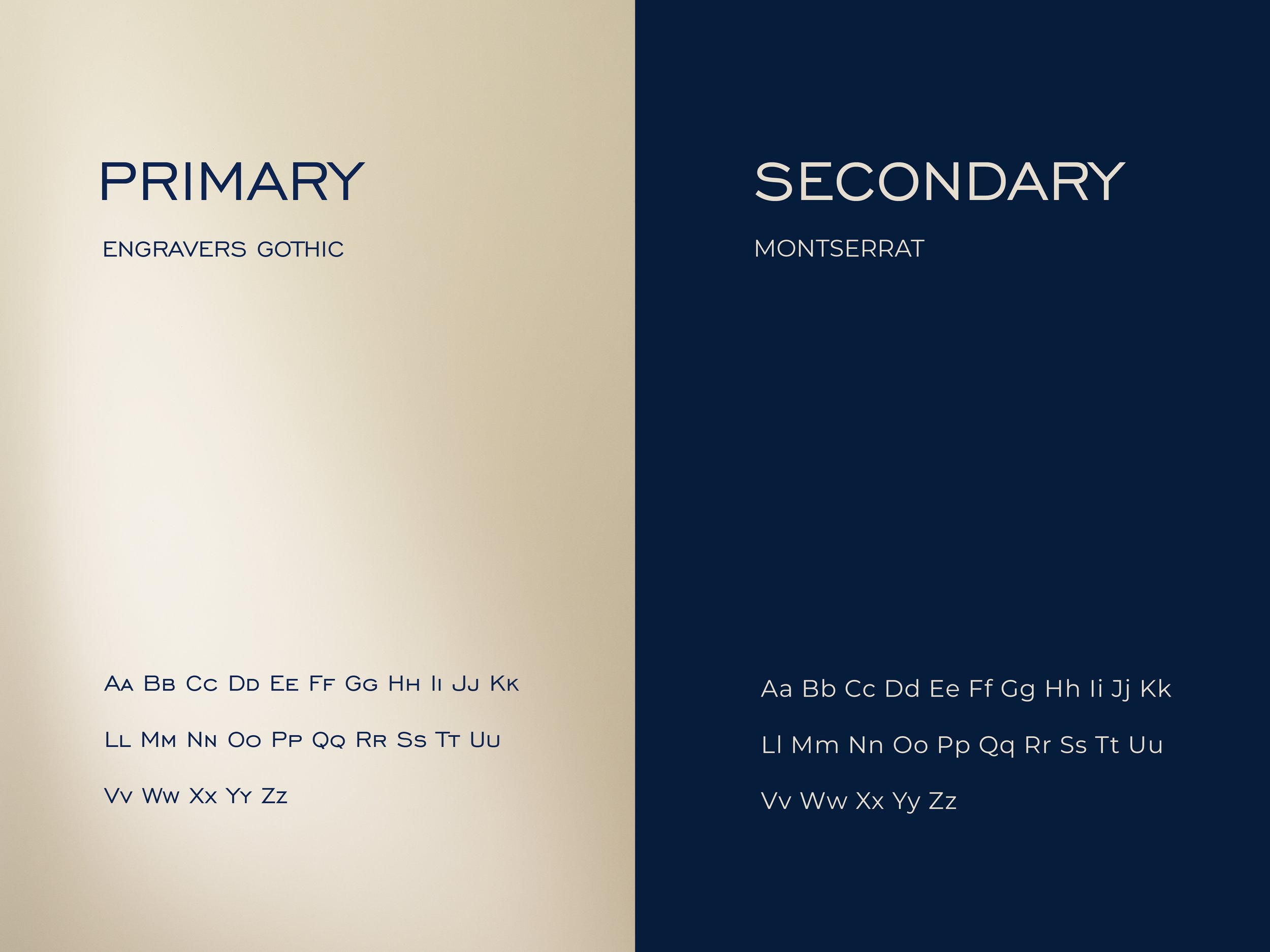
The typography that accompanies the logomark was chosen in order to match the feeling of the mark – a feeling of space, a forward-thinking approach and technology.
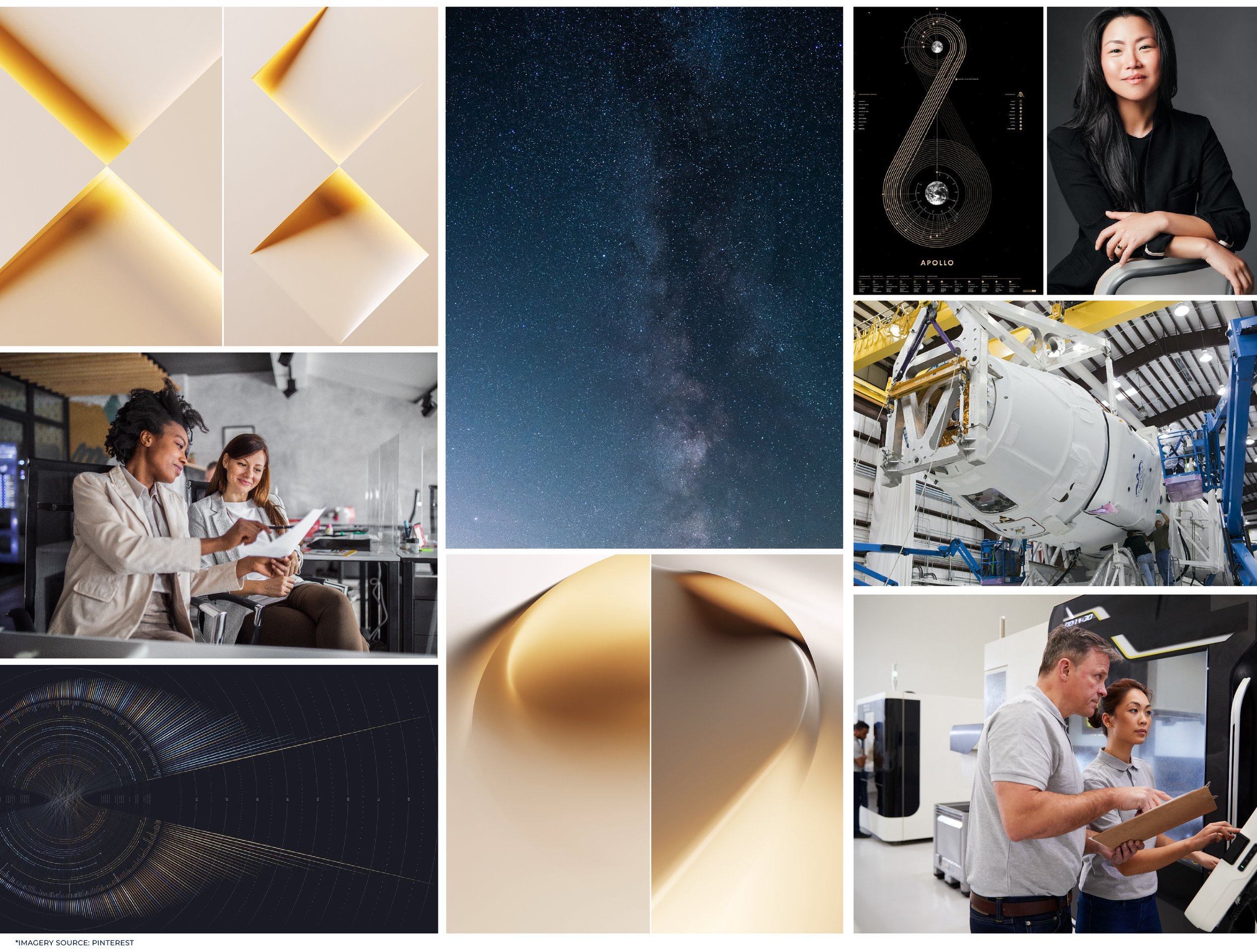
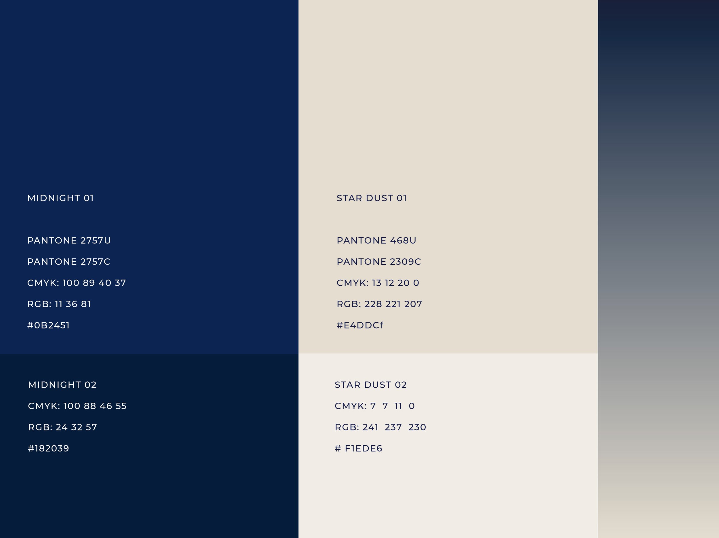
The brand colour palette was inspired by abstract, more human connotations to space – the darkness of the night sky and the lightness of the stars. This created a unique base for the brand to live on, making it stand out from its competitors.
SERVICES:
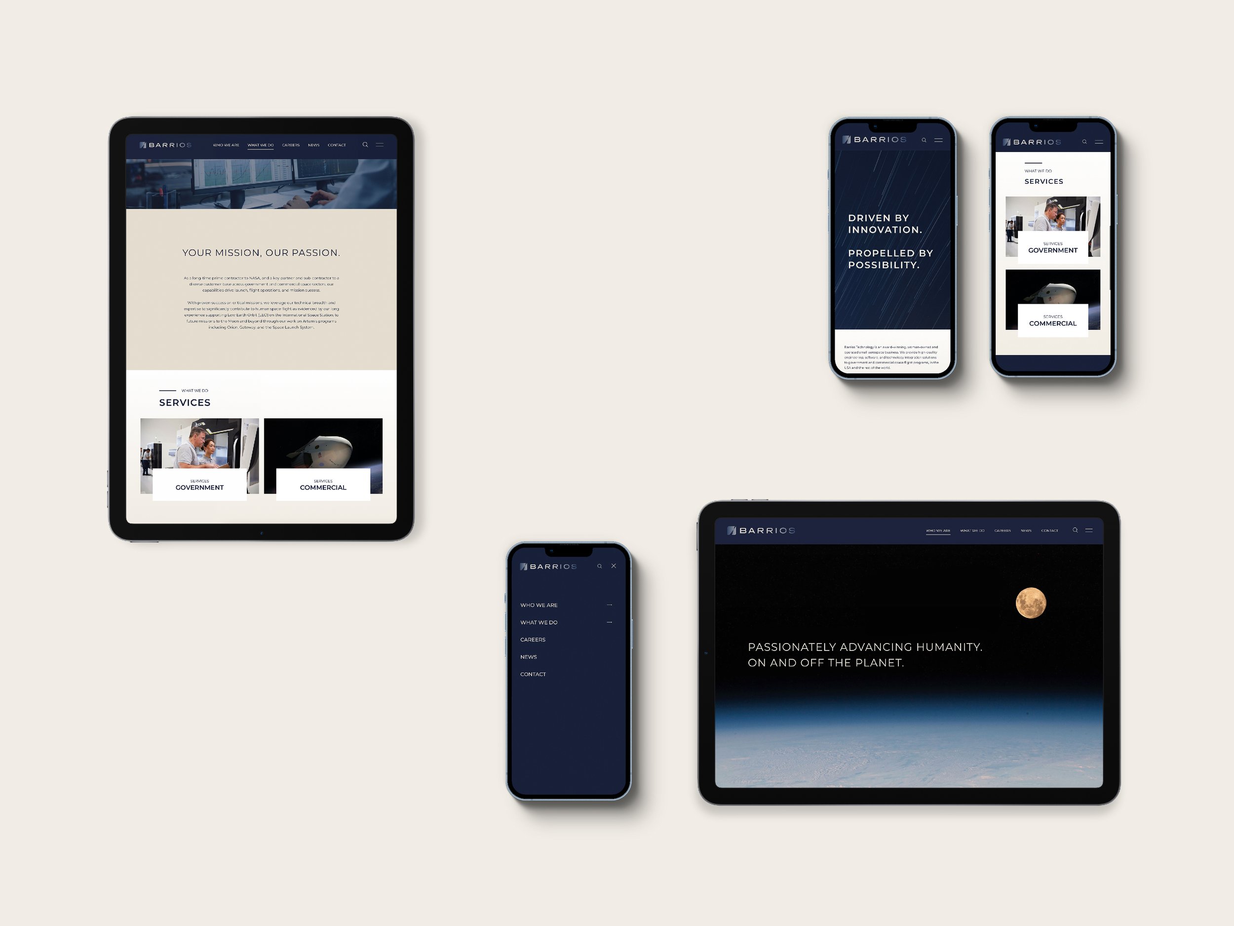
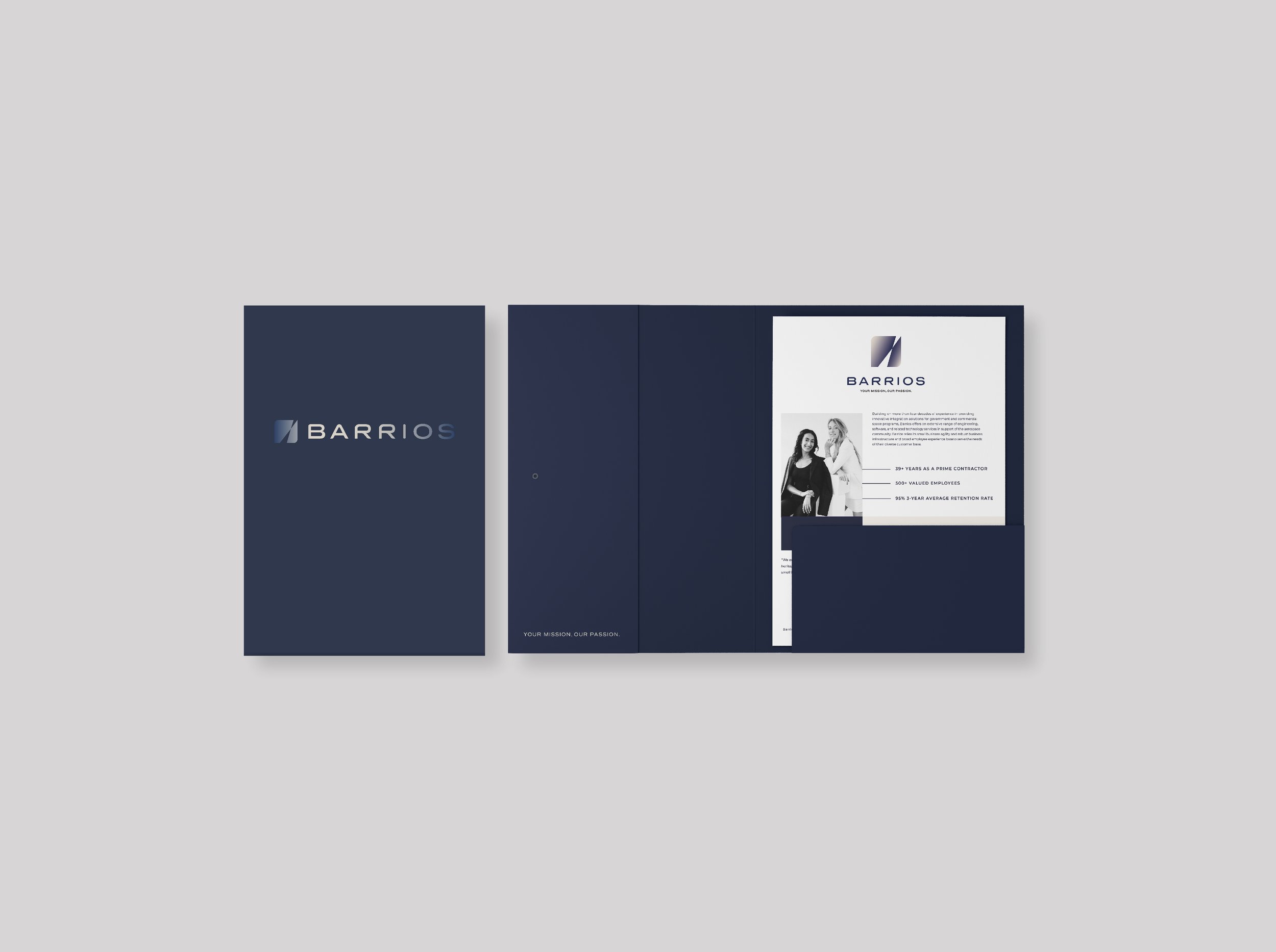
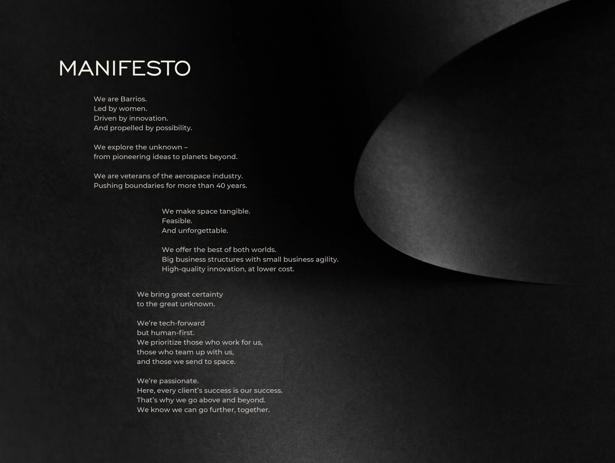
Brand Identity Design | Tagline Creation | Website Design in collaboration with Pierre | Brand Manual | Brand Manifesto | Brand Collateral Design | Project Management
